When to Use
Essential for collecting:- Email addresses - Newsletter signups, account creation
- Names - Personalization, customer records
- Phone numbers - SMS marketing, support
- Custom data - Ages, preferences, feedback
- Passwords - Account creation, login forms
Input Types
Choose the appropriate type for better user experience and validation:Configuration
Basic Settings
Placeholder Text Guide users with example input:- “Enter your email”
- “First name”
- “Your phone (optional)”
- Prevents form submission without input
- Shows validation message
- Adds asterisk (*) indicator
Validation
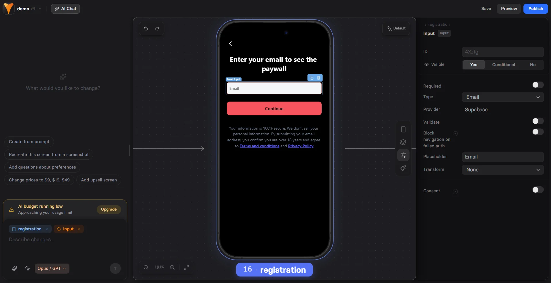
Email type inputs:- Validates format (name@domain.com)
- Errors appear only if the field is marked Required and the user tries to navigate to another screen without entering a valid email
- Integer only - Only whole numbers are allowed. Decimals (e.g., 3.5) are not accepted
- Min value and Max value - The minimum and maximum allowed values
- Exclusive: When set to Yes, the Min or Max value itself is not allowed
- Error message: Custom text shown for invalid values. You can provide your own message or keep the default one
Text Transformation
Automatically format input:Using Input Values
Variables
Input values become variables using the element ID:Multiple Inputs
Collect complete information:Conditional Logic
Show/hide elements based on input:Mobile Optimization
Text inputs are optimized for mobile: Appropriate Keyboards- Email: Shows @ and .com keys
- Number: Numeric keypad only
- Phone: Large number keys
- URL: No spaces, quick slash
- Autocomplete for common fields
- Autocorrect disabled for emails
- Auto-capitalization for names
- Password managers integration
- Minimum 44px height
- Clear tap areas
- Proper spacing between fields
On mobile, use single-column layouts for forms. Side-by-side inputs
are harder to complete on small screens.
Form Design Best Practices
Progressive Disclosure
Don’t overwhelm users: Page 1: Email only Page 2: Name and preferences Page 3: Additional details This approach:- Increases completion rates by 30%
- Captures emails for abandonment recovery
- Feels less overwhelming
Field Order
Optimal sequence:- Email (easiest to provide)
- Name (personal but simple)
- Phone (more hesitation)
- Address (highest friction)
Labels vs Placeholders
Use both for clarity:- Label: “Email Address”
- Placeholder: “john@example.com”
Advanced Features
Autocomplete Attributes
Enable browser autofill:Input Masking
Format input as users type:- Phone: (555) 123-4567
- Credit card: 1234 5678 9012 3456
- Date: MM/DD/YYYY
Multi-line Text
For longer responses:- Set “Multiline” option
- Adjustable height
- Good for feedback, comments
Email Collection Strategies
Two-Step Opt-in
Higher quality leads: Step 1: “Enter email for free guide” Step 2: “Check your email to confirm” Benefits:- Verifies email ownership
- Higher engagement rates
- Cleaner email list
Inline Validation
Immediate feedback:- ✓ Valid email format
- ✗ Invalid format
- ⚠️ Disposable email detected
Common Patterns
Newsletter Signup
Lead Magnet
Account Creation
Quiz Start
Conversion Optimization
Reduce Friction
- Single field per page - For critical inputs
- Optional indicators - Mark optional vs required
- Clear errors - Specific, helpful messages
Build Trust
- Privacy notice - “We’ll never spam you”
- Social proof - “Join 10,000+ subscribers”
- Benefits - “Get exclusive tips”
- Security - Lock icon for sensitive data
Increase Completion
- Progress indicators - Show form progress
- Save progress - Remember partial input
- Exit intent - Capture before leaving
- Inline validation - Fix errors immediately
Troubleshooting
Input value not saved
Input value not saved
- Element must have an ID
- Check for duplicate IDs
- Verify no JavaScript errors
- Input must lose focus to save
Variable not working
Variable not working
- Variable name matches ID exactly
- Use correct syntax:
{{element-id}} - Value updates after input loses focus
- Check for typos in variable name
Validation not working
Validation not working
- Email validation only works with email type
- Required validation needs form submission
- Number constraints need number type
- Check browser compatibility
Keyboard not showing correctly on mobile
Keyboard not showing correctly on mobile
- Verify input type is set correctly
- Test on actual device, not desktop browser
- Check for custom CSS interference
- Some keyboards vary by OS version
Integration Examples
With Checkout
Collect email before payment:With Options
Personalized path:With Analytics
Track form completion:Next Steps
- Use variables from inputs
- Add validation with actions
- Connect to webhooks for data sync
- Track conversions with analytics