When to Use
Strategic popup moments:- Email capture - Exit intent or timed popups
- Special offers - Limited-time deals
- Confirmations - “Are you sure?” dialogs
- Mini-funnels - Multi-step processes
- Notifications - Success/error messages
- Content gates - “Sign up to continue”
How Popups Work
Popups are containers that:- Start hidden by default
- Triggered by user actions or conditions
- Overlay the main content
- Can contain any other elements
- Dismissed by close button or actions
Configuration
Display Options
Show Close Button Toggle the X button:- Yes - Users can dismiss
- No - Force interaction
Removing the close button increases completion but can frustrate users.
Use only for critical flows like payment confirmation.
- True - Blocks page interaction
- False - Allows background clicks
Animation Type
Choose entrance style:Placement
Control popup position:Triggering Popups
Show/Hide Actions
Popups require triggers to appear: Common Triggers- On page load - After X seconds
- On scroll - At certain depth
- On exit intent - Mouse leaving
- On click - Button press
- On form submit - After action
Timing Strategies
Immediate (0-3 seconds)- Welcome messages
- Important notices
- Gate content
- Newsletter signup
- Special offers
- Engagement check
- Last chance offers
- Abandonment prevention
- Feedback request
Popup Content
Email Capture Popup
Confirmation Dialog
Multi-Step Mini-Funnel
Offer Announcement
Mobile Optimization
Popups adapt to mobile: Full-Screen Mobile- Popups expand to full width
- Better for forms
- Clear close button
- Touch-friendly spacing
- Stack elements vertically
- Larger text and buttons
- Simplified layouts
- Scroll if needed
- Lightweight overlays
- Smooth animations
- Fast loading
- Touch gestures
On mobile, consider using full-page overlays instead of small popups.
They’re easier to interact with and less likely to be dismissed accidentally.
Design Best Practices
Visual Hierarchy
- Contrast - Stand out from background
- Focus - One clear message
- Whitespace - Don’t overcrowd
- Brand - Match your style
Content Guidelines
- Headline - Clear value proposition
- Body - Minimal, benefit-focused
- CTA - Single, obvious action
- Trust - Privacy, guarantees
Size Recommendations
- Desktop - 400-600px wide
- Mobile - Full width or 90%
- Height - Auto (content-based)
- Max height - 80% viewport
Common Patterns
Exit-Intent Offer
Two-Step Opt-In
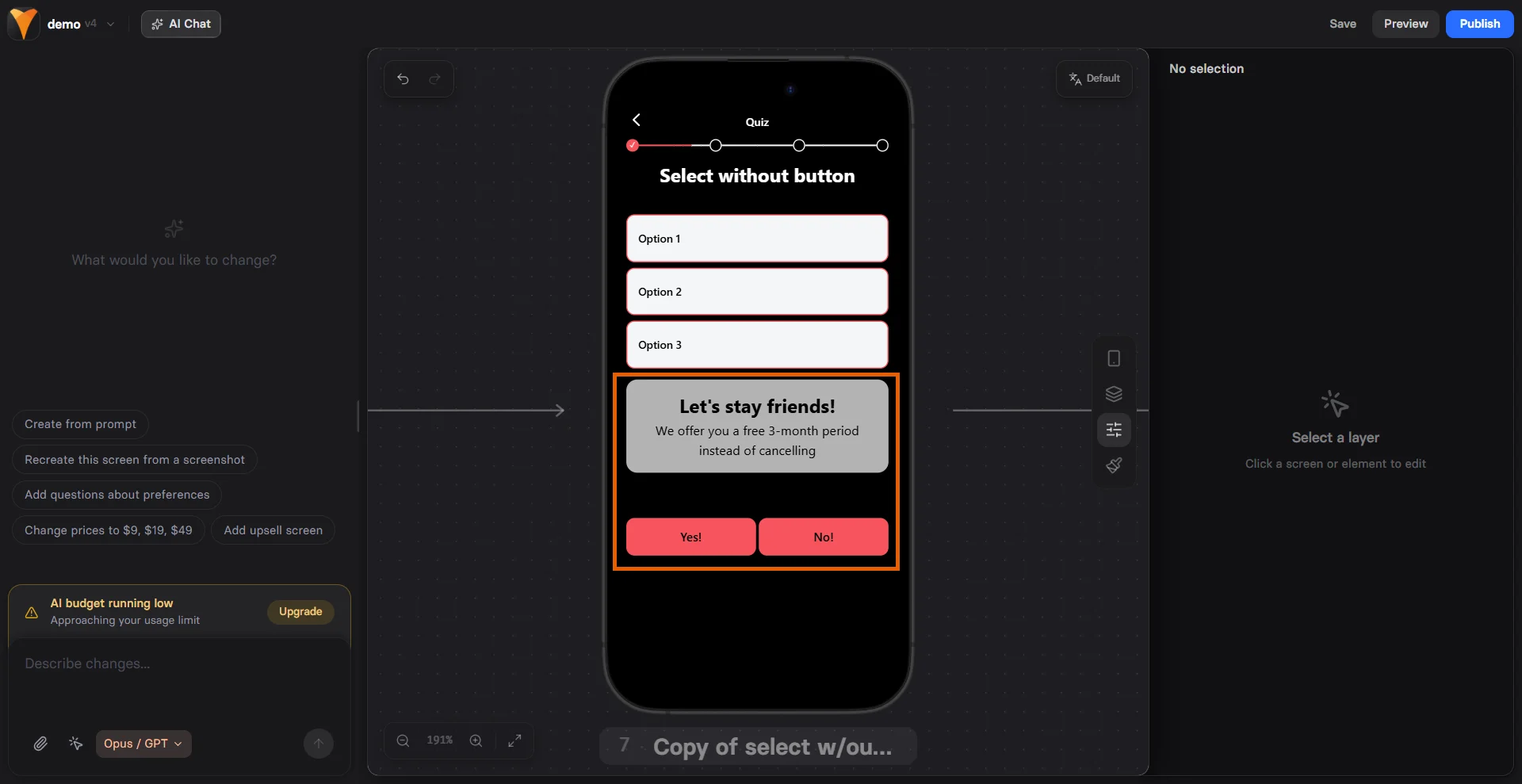
Quiz in Popup
Countdown Timer
Conversion Psychology
Interruption Theory
- Breaks pattern (increases attention)
- Creates micro-commitment
- Focuses on single action
- Removes distractions
Scarcity/Urgency
- Limited time offers
- Exclusive access
- One-time opportunities
- Fear of missing out
Social Proof
- “Join 10,000+ subscribers”
- Customer testimonials
- Trust badges
- Recent activity
Testing Variables
A/B test these elements:- Timing - 5s vs 10s vs exit
- Message - Discount vs value
- Close button - Yes vs no
- Animation - Fade vs slide
- Size - Small vs full-screen
Common Mistakes
Too Many Popups
- One per session maximum
- Space them out
- Different purposes only
Poor Timing
- Too early = annoying
- Too late = missed opportunity
- Test optimal moment
Weak Value Prop
- Generic “Subscribe” = low conversion
- Specific benefit = high conversion
Mobile Issues
- Too small to interact
- Blocks critical content
- Can’t close easily
Troubleshooting
Popup not appearing
Popup not appearing
- Check trigger configuration
- Verify popup ID matches
- Ensure visibility not set to “No”
- Look for JavaScript errors
Can't close popup
Can't close popup
- Enable close button
- Check modal settings
- Verify no CSS blocking
- Test touch targets on mobile
Content cut off
Content cut off
- Reduce content amount
- Check max-height settings
- Enable scrolling
- Test on small screens
Background still clickable
Background still clickable
- Enable modal behavior
- Check z-index values
- Verify overlay present
- Test across browsers
Analytics & Tracking
Track popup performance:- Show rate - How often triggered
- Interaction rate - Clicks/submissions
- Close rate - Dismissals
- Conversion rate - Completed goals
- Time to interaction
- Device differences
- Source/medium impact
- A/B test results
Next Steps
- Add triggers to show popups
- Include forms for data capture
- Track conversions with analytics
- Test variations with A/B tests