Use cases
Perfect for:- Quizzes - “What’s your fitness goal?”
- Preference collection - “Choose your interests”
- Product selection - “Pick your plan features”
- Surveys - “How did you hear about us?”
- Segmentation - Route users based on selections
Create Options
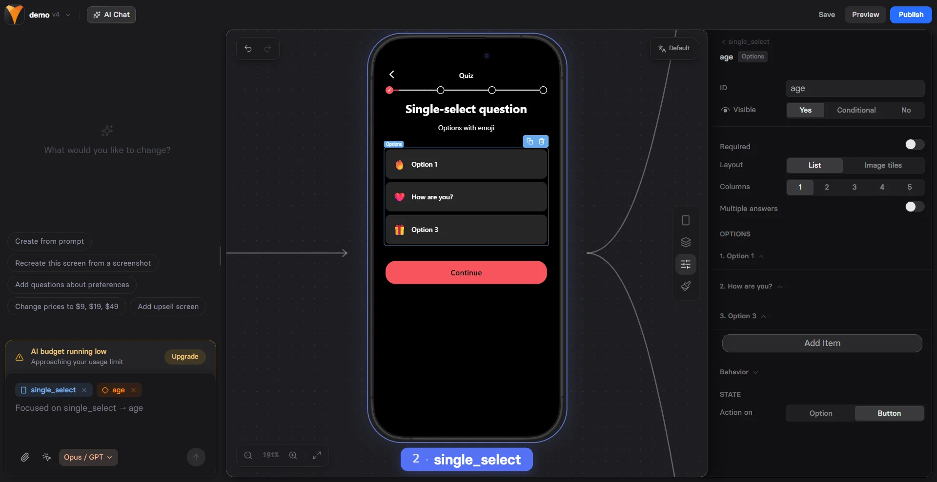
Prompt AI Chat in Editor to add a quiz screen. Or open the Layers tab, click + Add element and select Quiz, then follow the steps below.1. Configuration
Configure the Options type, then proceed with basic settings in the Parameters tab on the right. Options type:- Simple: Single-select options with text only
- Multiple Choice: Multi-select options with text only
- Emoji: Choices shown as emojis for fast, expressive taps. Supports multi-select
- Image picker: Visual selections displayed as image tiles or cards. Supports multi-select
- Icons: Compact icon (or icon + label) options for scannable choices. Supports multi-select
- Rating: A 1–n scale (e.g., stars) for scoring or satisfaction
- List: Traditional vertical list for text-heavy options
- Image tiles: Grid of image cards for visual selection
- Randomize order: Randomizes the order of options each time the screen is displayed
- Single select: Set Multiple answers to No to allow only one choice.
- Multi select: Set Multiple answers to Yes to allow multiple choices. Use Max selections to limit the number of choices (e.g., for quizzes like “Choose your top 3”).
2. Element settings
- Element ID: Set up element name if you want user replies to be used for variables
- Visibility: Show/hide the element based on conditions
- Required: Make selection mandatory to prevent advancing without selection
3. Option settings
In the Parameters tab, set up each individual option:- Visibility: Show/hide the option based on conditions such as other selections or previous user replies
- Label: Defines the text shown to the user and supports variables. Editable directly on the canvas
- Value: The reply stored for variables you can use later
- Acts as “Select all” / “Select none” (for multiselect only): Lets one option toggle all other options on the screen. Select all cannot select an option marked as Select none, and vice versa.
- Image: Allows you to upload images for tile layouts or use an emoji as the option label
4. Option layout
Beyond the overall Options element layout, you can also adjust the layout of each individual choice. In the Styles tab, go to Configured to fine-tune visual properties and the pressed state.5. Actions & triggers
This step applies to single-select Options only. For multi-select Options, use buttons to set up actions and triggers.
- State: Select Option to fire triggers immediately or Button for actions after all selections
- Action: Set up triggers to fire. Learn more about actions & triggers
User replies
Access replies data
User responses to options (replies) are stored as values for variables. For example (single select):- By using replies as variables
- Through API calls
- Through webhook events
Replies as variables
Use replies for personalization with variables:1
Collect Response
Options element with ID
user-level2
Show Conditional Content
Show advanced tips if
{{user-level}} equals “expert”3
Route to Different Paths
Button action: Navigate to page based on
{{user-level}}Quiz structure
Build engaging quizzes with Options. As a best practice, follow this flow:- Welcome screen - Set expectations
- Question screens - One Options element per screen
- Processing - “Calculating results…” with Loader
- Results - Personalized based on answers
- Offer - Tailored product recommendation
Next steps
- Use variables from option replies
- Add conditional visibility
- Create multi-step quizzes