Common Use Cases
Primary CTAs
“Get Started”, “Continue”, “Sign Up” - main conversion drivers
Navigation
Move users through your funnel flow with clear next steps
External Links
Link to app stores, websites, or deep links into apps
Purchase Actions
Trigger checkout flows, upsells, or subscription upgrades
Properties
Element Tab
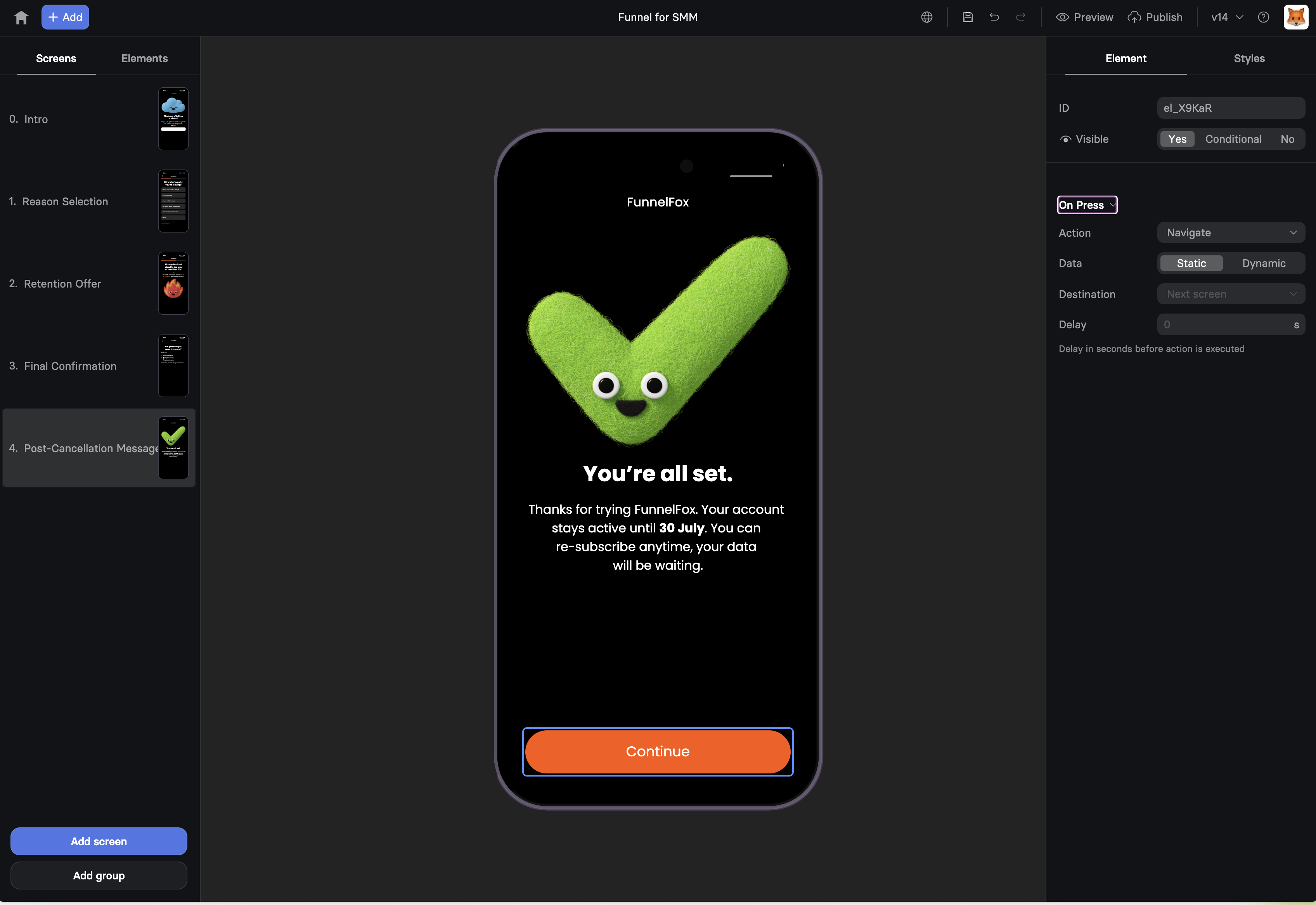
Trigger: On Press
Buttons have a single trigger that fires when tapped/clicked. Configure what happens using the Action settings. See Actions & Triggers for complete details on:- Action types: Navigate, Show/Hide, Purchase, External Link, etc.
- Dynamic actions: Conditional routing based on user data
- Data field: Analytics tracking configuration
- Delay: Adding delays before actions execute
Buttons automatically show a loading state during async actions like
purchases or API calls. This provides immediate feedback and prevents
double-clicks.
Styles Tab
Button-Specific Styles
Width
Control how much space the button occupies:- Percentage: Width relative to container (e.g., 100% for full-width)
- Auto: Size based on text content
Padding
Internal spacing between button text and edges:- Top/Bottom: Vertical breathing room
- Left/Right: Horizontal spacing
- Larger padding = bigger, more prominent button
Background
Button fill color with opacity control:- Use brand colors for primary actions
- Lighter/muted colors for secondary actions
- Transparency for ghost buttons
Roundness
Corner radius in pixels:0px: Sharp corners (formal, serious)8-12px: Slightly rounded (modern, friendly)50px+: Pill-shaped (playful, approachable)
Visual Effects
Pulse Animation
Add a subtle pulsing effect to draw attention:- None: Static button (default)
- Pulse: Gentle scaling animation
- Duration: How long each pulse takes (in seconds)
- Easing: Animation smoothness (Ease In, Ease Out, Linear)
Shadow
Add depth with customizable shadows:- Shadow Color: Often matches button color at lower opacity
- Shadow Size: Pixel spread of the shadow
- Creates visual hierarchy and makes buttons appear “clickable”
Text Styles
Configure button label appearance:- Color: Text color (ensure high contrast with background)
- Font: Inherit from theme or custom selection
- Size: Text size in pixels
- Weight: Regular, Medium, Bold, etc.
- Align: Left, Center (most common), Right
- Line Height: Spacing for multi-line text
Apply Styles Globally
The “apply styles to all Buttons” link sets default styling for all buttons in your funnel. See Text element documentation for how global styles work. For common container properties (position, offset, borders), see Elements Overview.Best Practices
Make It Obvious
Buttons should look clickable. Use color, shadows, and size to make
them stand out from other content.
Clear Labels
Use action-oriented text. “Get Your Free Trial” beats “Submit”.
Tell users exactly what happens next.
Thumb-Friendly
Minimum 44px height on mobile for easy tapping. Consider thumb reach
zones for placement.
Visual Hierarchy
One primary button per screen. Secondary actions should be visually
less prominent.
Mobile Optimization
- Full-width buttons often work better than centered narrow ones
- Place primary CTAs in the thumb zone (bottom third of screen)
- Avoid multiple buttons side-by-side on small screens
- Test tap targets - ensure buttons aren’t too close together
Performance Tips
- Limit animations: One pulsing button maximum per screen
- Consider contrast: High contrast improves perceived performance
Troubleshooting
Button not responding to clicks
Button not responding to clicks
Loading state stuck
Loading state stuck
- Check network requests in browser console
- Verify API endpoints are responding
- Test with simpler action first (like Navigate)
- Check for JavaScript errors blocking completion
Text cut off or wrapping badly
Text cut off or wrapping badly
- Increase button width or reduce font size
- Check padding isn’t too large
- Test with longest possible variable values
- Consider shorter, punchier labels
Button looks different on mobile
Button looks different on mobile
Pulse animation not showing
Pulse animation not showing
- Verify Visual Effects is set to “Pulse”
- Check animation duration isn’t 0
- Ensure button is visible on screen
- Try refreshing preview to restart animations
Next Steps
- Actions & Triggers - Configure button behaviors
- Text Input Elements - Collect data before button actions
- Elements Overview - Learn about other elements
