
Analytics starts updating data daily at 00:00 UTC to ensure consistency across global teams.
Key benefits
FunnelFox Analytics shows exactly how users move through your funnels, where they drop off, and what drives revenue.KPIs at a glance
The Overview tab surfaces nine headline KPIs for any period — revenue,
subscriptions, sessions, and conversion — each with its change versus the
previous period.
Measure what converts
Track conversion rates at every step, from the first screen to paywall,
checkout, and upsell.
Understand revenue
Break down Net Revenue, ,
and by
funnel, product, or payment method.
Drill into any metric
Open any metric in Charts, group it by dimension, and explore the
breakdown in a sortable, exportable table.
Overview
The Overview tab is the default tab of your Analytics page. It gives you a high-level, zero-setup snapshot of how your funnels perform.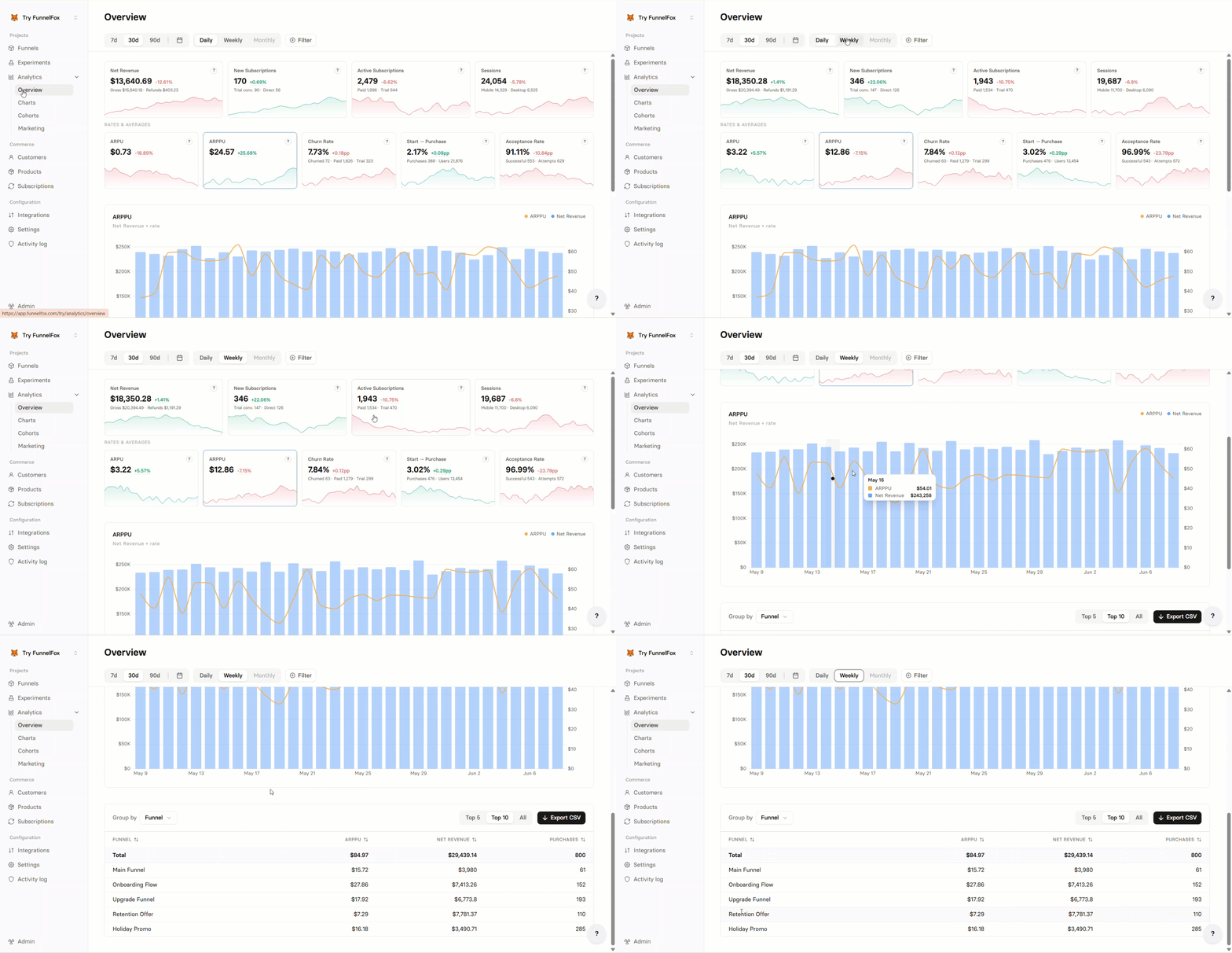
- Totals: Net Revenue, New Subscriptions, Active Subscriptions, Sessions.
- Rates & averages: ARPU, ARPPU, Churn Rate, Start → Purchase, Acceptance Rate.
- Filter your data.
- Choose the time range.
- Set the granularity to Daily, Weekly, or Monthly.
- Hover over any chart point to see more details.
Charts
To explore a single metric in depth, go to Analytics > Charts.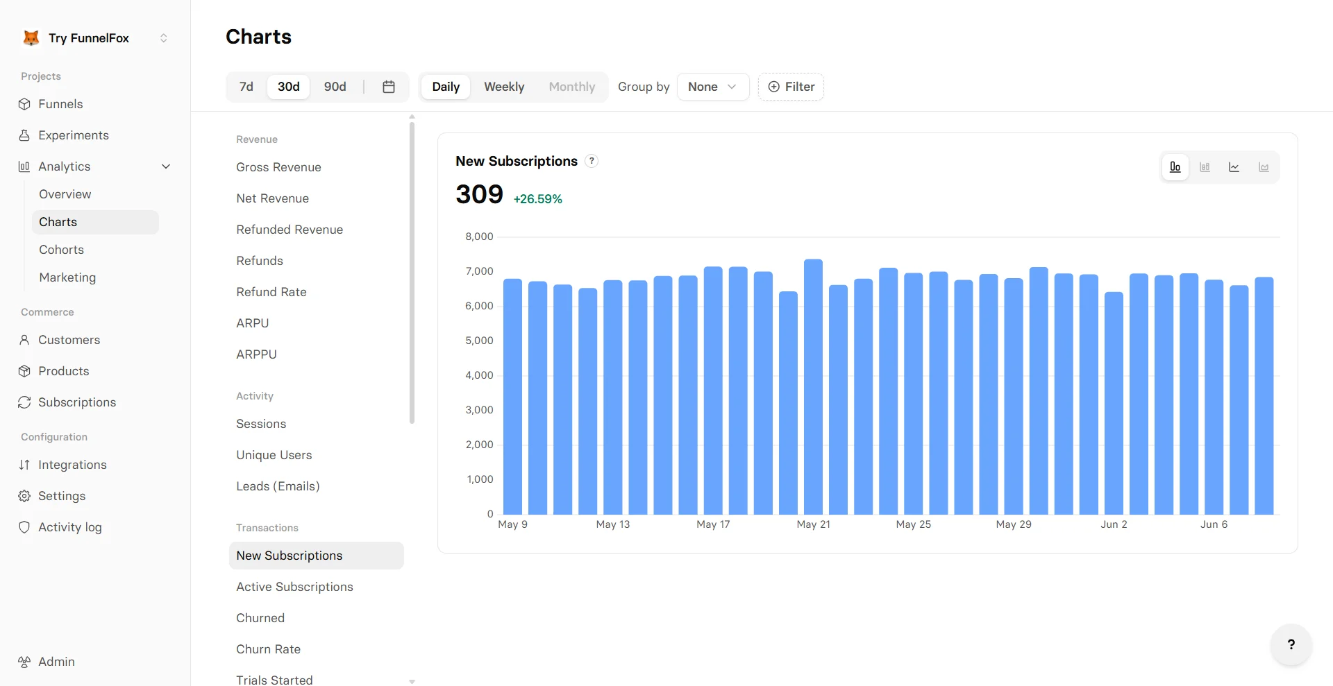
- Revenue: Gross Revenue, Net Revenue, ARPU, ARPPU.
- Activity: Sessions, Unique Users, Leads (Emails).
- Transactions: New Subscriptions, Active Subscriptions, Churned, Churn Rate, Trials Started, Trials Converted, Purchases, Payment Attempts, Upsell Revenue, Upsells.
- Conversion rates: By Step, Start → 2nd Screen, 2nd Screen → Email, Start → Purchase, Start → Subscription, Start → Paywall, Paywall → Subscription, Checkout → Subscription, Trial → Paid, Sub → Upsell.
- Filter and group your data. Grouping also unlocks the Stacked bar and Stacked line chart types.
- Choose the time range
- Set the granularity to Daily, Weekly, or Monthly
- Switch between Bar and Line chart types
Cohorts
To open cohort analysis, go to Analytics > Cohorts. Cohorts group your users by when they started, then track how their Net Revenue, , and build up over time. Use them to measure retention and monetization and to compare older cohorts against newer ones.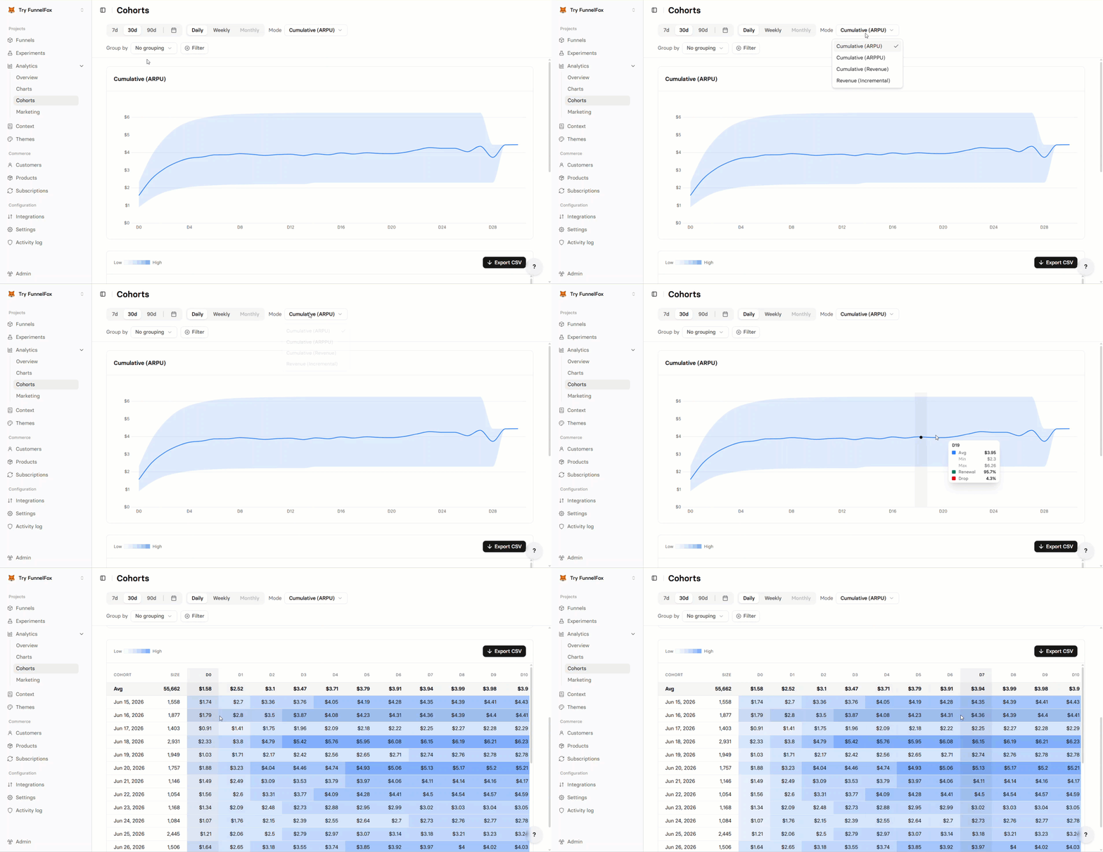
Cohort modes
The Mode dropdown is the master control for your cohorts. Each mode sets two things at once: how period values accumulate and which metric they measure. It drives both the chart and the table below it.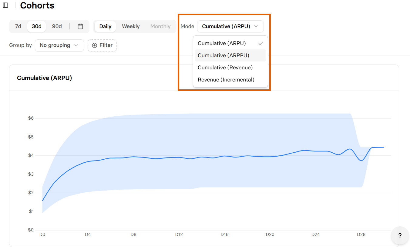
Accumulation controls how each period column is calculated:
- Cumulative: Each period is a running total carried forward from Period 0, so the value only rises over time unless refunds pull it down. It answers “how much has this cohort delivered so far” and builds toward LTV.
- Incremental: Each period shows the value produced in that period alone. Values usually decline as renewals taper, and a period can go negative when refunds outweigh revenue. Incremental is available for Net Revenue only.
Cohorts chart
Each mode draws one chart, titled after the mode. What it shows depends on Group by: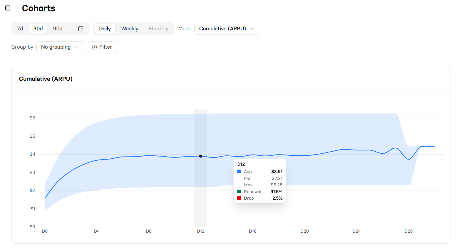
- Without grouping: A single average line with a shaded band for the
lowest-to-highest cohort spread. Hovering a period shows Avg, Min,
Max, and, from Period 1 on, Renewal % and Drop % (
100 - Renewal). - With grouping: One line per group, with a Top N selector (Top 5, Top 10, or All) to cap how many lines appear. The band and Renewal/Drop figures are hidden.
Cohorts table
The table shows the same metric as the chart, one row per cohort, in the cohort’s currency. The left columns stay fixed while you scroll through periods: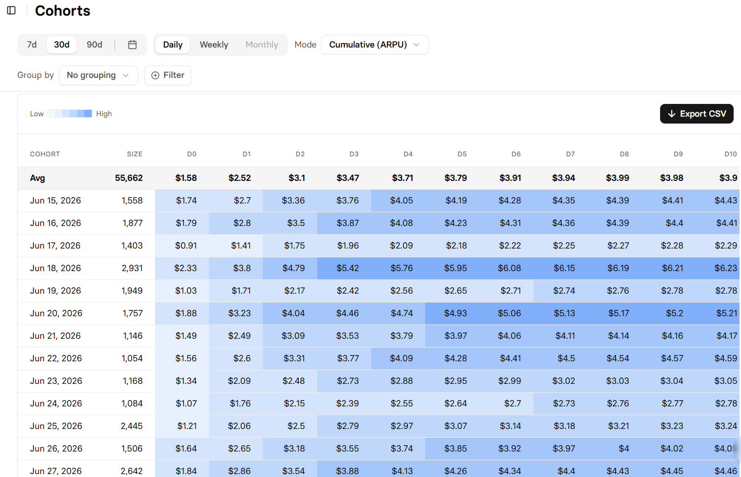
- Cohort: The start date (
Mon DD YYYY, orMon YYYYwhen monthly), or the group name when Group by is active. - Size: The number of users in the cohort.
- LTV: Lifetime value per user, shown for Net Revenue only.
- Period columns: Labeled D0 / W0 / M0, D1 / W1 / M1, and so on. Period 0 is the start; a dash marks periods a cohort has not reached yet.
Cohort attribution
A user joins a cohort based on the calendar period of their first recorded event. For Net Revenue, that is the first transaction of any kind: a purchase, one-time payment, trial start, renewal, or even a refund. For ARPU and ARPPU, it is the first session, so a user with sessions but no purchase is still a cohort member. The anchor never moves once set.Amounts below are described per period, matching the Incremental mode. In
a Cumulative mode, the same period shows the running total instead.
- Free trials: , at $0 when the trial is free. The first paid charge lands in a later period, and the user still counts toward the cohort’s Size from Period 0. A trial-to-paid conversion is not itself counted in the chart’s Renewal %.
- Paid trials: ; the later activation lands in its own period.
- Renewals: , and the user stays in the original cohort.
- One-time payments and upsells: and never start a new cohort. If a one-time payment is the user’s very first transaction, it anchors that cohort.
- Refunds and chargebacks: , not the original purchase period, and can push a period negative.
- Subscription pauses: ; the resume charge lands in its period, and the user stays in the same cohort.
Cohort totals can differ from the Overview and Charts tabs. Cohorts include
only users first seen within the selected range and re-bucket revenue by
period-since-start, while Overview and Charts sum every in-range transaction
by calendar date. Upsells and refunds are included in both.
Example
Here is how one cohort fills in, using the Net Revenue metric at weekly granularity:1
A cohort forms
Every profile whose first transaction lands in the week of June 2,
2025 forms one cohort. Say 200 users join, and their first charges
total $4,000. This is Period 0 (W0).
2
Later periods fill in
In W1, renewals add $1,200. In W2, renewals add $1,000 but a $200
refund also lands, so W2’s own revenue is $800. Cells show a dash for
any period the cohort has not reached yet.
3
Incremental vs. cumulative
In Revenue (Incremental), each period shows its own value: $4,000,
$1,200, $800. Switch to Cumulative (Revenue) and the same periods
show the running total: $4,000, $5,200, $6,000.
4
Read the LTV
LTV divides total net revenue by cohort size: $6,000 ÷ 200 users =
$30 per user. The LTV column appears in the Net Revenue modes only.
Metrics explained
Analytics tracks the following metrics across the Overview and Charts tabs. The Charts selector groups them into four categories.Revenue
Total revenue from all purchases before any refunds, chargebacks, or fees
are deducted.
Gross Revenue minus refunds and chargebacks. Refunds can arrive up to 30
days after purchase, so recent amounts may adjust.
Average Revenue Per User. Total revenue divided by unique users who started
the funnel, including both paying and non-paying users.
Average Revenue Per Paying User. Total revenue divided by unique paying
users — how much each paying user spends on average.
Activity
number
Total number of sessions (visits) in the period. One user can have multiple
sessions.
number
Distinct users who opened the funnel at least once. Deduplicated by user
identifier across sessions.
number
Email addresses captured through funnel forms. Counted once per unique email
per period.
Transactions
number
Subscriptions that made their first payment in the period, either as a
direct start or as a trial conversion. Trials don’t count until they
convert, and renewals don’t count. An upsell that creates its own
subscription counts as a new subscription.
number
Paid subscriptions and running trials at the end of each interval. A
subscription stays active while the period it paid for is still running,
even after it’s cancelled. Paused subscriptions don’t count.
number
Paid subscriptions whose paid period ended in the period without renewal.
Cancelling doesn’t churn a subscription: it stays active until its paid
period ends. Trials and paused subscriptions don’t count.
percentage
Churned subscriptions divided by all paid subscriptions that could have
churned in the period: the paid base at the start plus subscriptions that
joined during the period. Lower is better.
number
New trial subscriptions started. Counted when the trial begins, regardless
of whether it later converts.
number
Trials that converted to a paid subscription. Counted on the date the first
paid charge succeeds.
number
Purchase transactions with money: initial subscriptions, trial conversions,
paid trials, one-time payments, and upsells. Renewals and free trial starts
are not included.
Revenue generated from upsell offers accepted after the initial purchase.
number
Number of upsell offers accepted. Each accepted upsell counts once
regardless of amount.
Conversion rates
percentage
Drop-off rate at each funnel step. Shows what percentage of users advance
from one step to the next:
- Bars show conversion relative to the initial screen.
- The line shows conversion relative to the previous screen.
- By default, the chart reflects the latest published funnel version.
By Step will be replaced by a dedicated funnel-analytics page.
percentage
Unique users who completed a purchase divided by unique users who saw the
first screen. How well your funnel converts traffic into paying customers.
percentage
Unique users who started a subscription divided by unique users who saw the
first screen. Measures end-to-end conversion from first visit to
subscription.
percentage
Unique users who reached the paywall divided by unique users who saw the
first screen. Shows how effectively early steps drive users toward pricing.
percentage
New subscribers divided by users who reached the paywall. Measures how well
your pricing page converts interested users.
percentage
Completed subscriptions divided by users who started checkout. Measures
payment form completion rate.
percentage
Trials converted to paid divided by total trials started. How well your
trial experience converts to paying customers.
percentage
Unique users who accepted an upsell divided by unique users who started a
subscription. Measures upsell conversion among subscribers.
Set up tracking
Screen type
For conversion rate analytics, mark your screen types in the Editor. The fastest way is to prompt AI Chat in Editor. Manual settings still work if you prefer.1
Open the funnel in the Editor
Open your funnel and either prompt AI Chat in Editor (e.g.,
“Set this screen as a Paywall”) or select each screen manually.
2
Set screen type
Available types:
- Default
- Auth
- Checkout
- Finish
- Paywall
- Upsell
3
Republish funnel
Save and publish your funnel to activate tracking.
Filters
To narrow results to those that matter for your decisions, you can filter data on every Analytics tab by time range. The Overview and Charts tabs share the same set of filters:- Country
- Language
- Device
- OS
- Funnel
- Product
- UTM Source
- UTM Medium
- UTM Campaign
- Payment Provider
- Payment Method
- Currency
- Transaction Type
On the Charts By Step view, the Funnel filter is replaced by a dedicated funnel selector.
- Cumulative (ARPU) offers 8 filters: Country, Language, Funnel, Device, and OS (multi-select), plus UTM Source, UTM Medium, and UTM Campaign (free text).
- The ARPPU and Net Revenue modes add 5 more: Product and Currency (free text), Payment Provider (Stripe, Paddle, PayPal, Billing, Solidgate), Payment Method (free text), and Transaction Type (Renewal, Direct Subscription, Trial Conversion, Free Trial, Paid Trial).
Cohorts no longer filter by billing period. The closest equivalent is the
Transaction Type filter, available in the ARPPU and Net Revenue modes.
Grouping
Grouping splits your data by a dimension so you can compare segments. The Overview breakdown table, the Charts tab, and the Cohorts tab all support grouping, each with its own set of dimensions.Grouping options available on the Overview tab
Grouping options available on the Overview tab
- Billing Reason
- Browser
- Browser (with version)
- Card Type
- City
- Country
- Currency
- Device
- Experiment
- Funnel
- Language
- OS
- Payment Method
- Payment Provider
- Product
- Project
- UTM Campaign
- UTM Medium
- UTM Source
Grouping options available on the Charts tab
Grouping options available on the Charts tab
- Browser
- Browser (with version)
- City
- Device
- Funnel
- Language
- Project
- Experiment
- Currency
- Country
- Payment Provider
- Billing Reason
- Product
- OS
- UTM Campaign
- UTM Medium
- UTM Source
Grouping options available on the Cohorts tab
Grouping options available on the Cohorts tab
Cohort grouping depends on the selected
mode. “No grouping” is always
available.The Cumulative (ARPU) mode offers 12 dimensions:
- Country
- Language
- Funnel
- UTM Source
- UTM Medium
- UTM Campaign
- Device
- OS
- Browser
- Browser (with version)
- City
- Experiment
- Card Type
- Currency
- Payment Method
- Payment Provider
- Product
- Transaction Type
Each dimension applies only to relevant metrics. Options that don’t apply to the selected metric are disabled.
Troubleshooting
No data showing
No data showing
- Check that your funnel is published (draft funnels don’t track).
- Note that subscriptions data is available in Charts and Cohorts starting from June 17, 2025.
- Republish older funnels since funnels published before December 24, 2024 have basic tracking only.
Incorrect metrics
Incorrect metrics
Check the time zone. Analytics starts updating data daily at 00:00 UTC to ensure consistency across global teams.
Missing conversion data
Missing conversion data
- Set screen types properly in the Editor.
- Republish funnel after changes.