Adding Elements
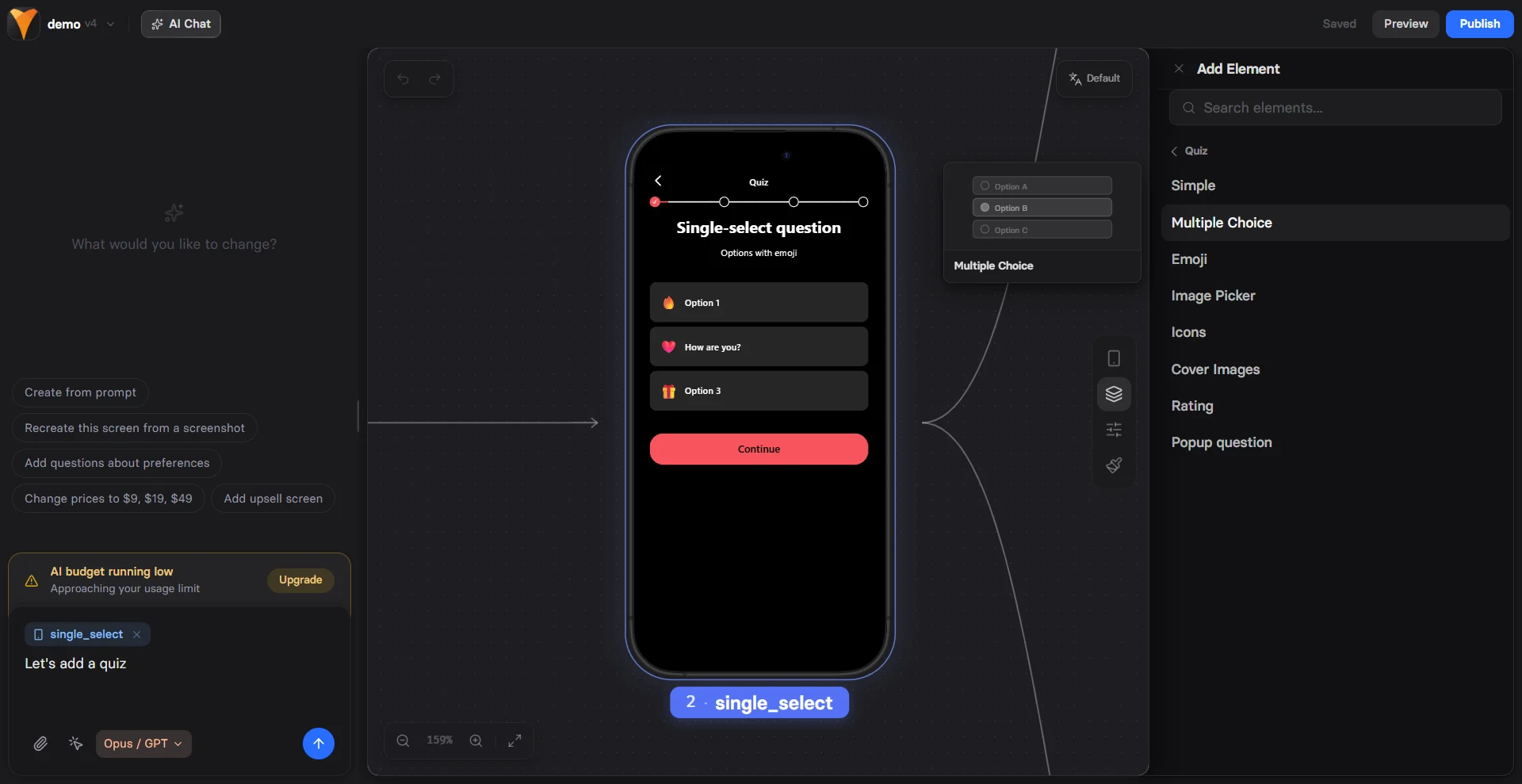
The fastest way to add elements is to prompt AI Chat in Editor on the canvas, for example:add a plan picker with three monthly tiers and a CTA button. The agent picks the right elements, configures them, and lays them out on the screen.
You can also drag elements from the left panel onto your screen in the Editor. Each element automatically adapts to mobile and desktop views while maintaining your design intent.
Common Properties
Every element shares these foundational properties that control identification, visibility, and behavior.Element Tab
ID
Unique identifier for the element. Auto-generated but customizable. Why IDs matter:- Variables: Stateful elements (inputs, dropdowns, etc.) with IDs create variables
- Analytics tracking: Track specific element interactions
- Dynamic actions: Reference in show/hide actions
Visibility
Control when and how elements appear:
See Conditional Visibility below for detailed rules and options.
Conditional Visibility
Create sophisticated display rules based on user data and context: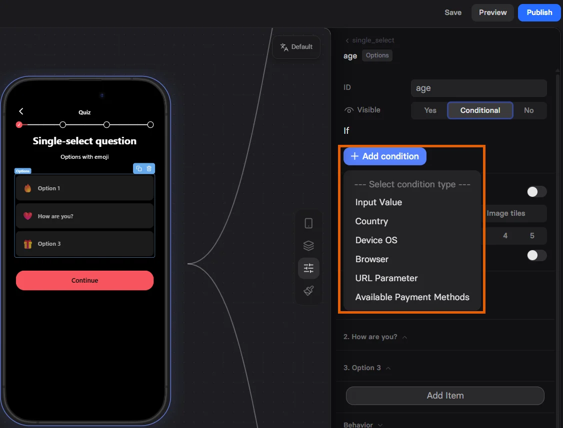
Condition Types
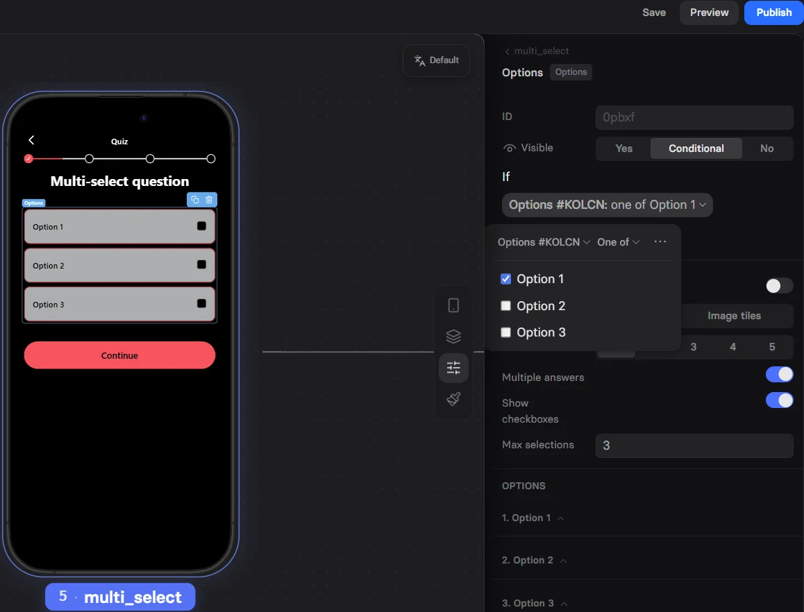
Input Value Check user inputs or variables against conditions:- Equals, Not equals
- Greater than, Less than
- Contains, Does not contain
- Empty, Not empty
- Is one of (multiple values)
- iOS
- Android
- Other (Desktop, etc.)
- Chrome
- Firefox
- Safari
- Instagram (in-app)
- Facebook (in-app)
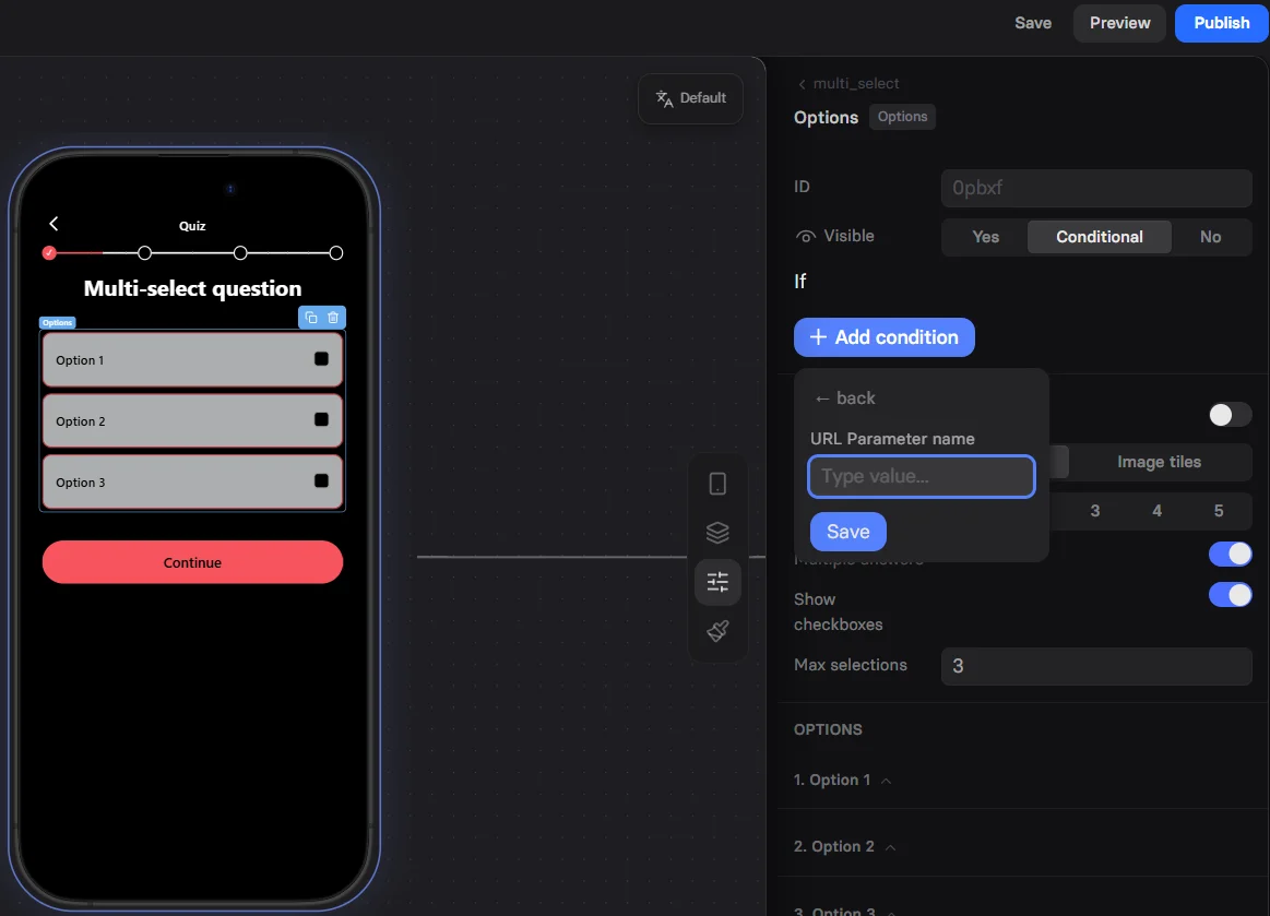
- Paid: Entry URL has a known ad-network click ID (e.g.
gclid,fbclid) - Organic: No recognized click ID
- Primarily for Apple Pay availability
- Useful for payment method selectors and Wallet buttons
Combining Conditions
Add multiple conditions with logical operators:- All conditions must be true (AND logic)
- Any condition must be true (OR logic)
Styles Tab
Access the Styles tab in the selector on the right. Common styling properties available for all elements:
Container Styles
Offset
Position adjustment relative to default placement:- Horizontal offset (px)
- Vertical offset (px)
Position
How the element is positioned:- In content: Normal document flow
- Attached: Fixed position - stays visible in viewport (e.g., sticky button at bottom)
- Attached on scroll: Becomes fixed after scrolling into view (sticky behavior)
Padding
Internal spacing between content and element border:- Top, Right, Bottom, Left (px)
- Use for breathing room around content
Visual Styles
Background
- Color: Solid background color with opacity
- Gradient: Two-color gradients (if supported)
- Image: Background images for containers
Roundness
Corner radius in pixels:0px= Sharp corners8px= Slightly rounded (modern)100px= Pill-shaped (for buttons)
Border
- Width: Border thickness (px)
- Color: Border color with opacity
- Style: Solid, dashed, dotted (element-specific)
Shadow
Add depth with shadows:- Toggle on/off
- Customize shadow properties (element-specific)
- “Show less” for preset shadows
- Expand for detailed control
Geo-Targeted Offers
Personalize based on location:Campaign-Specific Elements
Show elements for marketing campaigns:Troubleshooting
Elements duplicate, lag, or behave unexpectedly
Elements duplicate, lag, or behave unexpectedly
- Save your funnel.
- Delete the problematic element.
- Add the element back and reconfigure it.
- Reload the page and test again.
Error: “Failed to fetch dynamically imported module” when editing visibility conditions
Error: “Failed to fetch dynamically imported module” when editing visibility conditions
- Save the funnel.
- Reload the page.
- Edit the conditions again.
Next Steps
- RAW Element - Add custom HTML and JavaScript
- Button Element - Create compelling CTAs
- Input Elements - Collect user information
- Actions & Triggers - Make elements interactive