When to Use
Perfect for:- Feature lists - What’s included in your offer
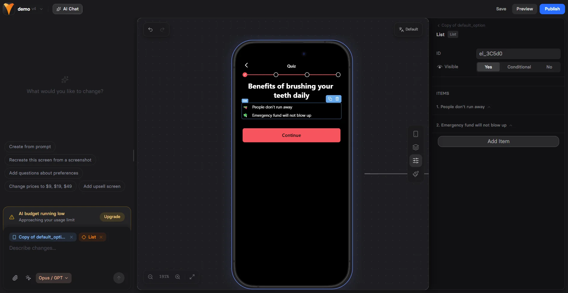
- Benefits - Why users should care
- Process steps - How something works
- Guarantees - What you promise
- Social proof - Key achievements
- Comparisons - This vs that
Lists increase readability by 40% compared to paragraphs. Users scan
lists quickly, making them perfect for highlighting value propositions.
Creating List Items
Each list item consists of:Text Content
The actual list point:- Keep concise (1-2 lines ideal)
- Start with action verbs
- Focus on benefits
- Use parallel structure
Marker Options
Choose your bullet style:Marker Configuration
Emoji Markers
Add personality with emojis:- ✓ ✅ ☑ - Checkmarks
- 🎯 🎪 🏆 - Achievement
- 💡 🔥 ⚡ - Energy
- 🛡 🔒 🔐 - Security
- ⭐ 🌟 ✨ - Quality
Image Markers
Custom icons for branding:- Upload small images (24-48px)
- Use consistent style
- Consider loading time
- Match brand colors
- Small: 16px
- Medium: 24px
- Large: 32px
Iterator Markers
Numbered or lettered lists:- First step
- Second step
- Third step
List Patterns
Feature List
Benefit Stack
Process Steps
Comparison List
Social Proof Points
Mobile Optimization
Lists are naturally mobile-friendly: Responsive Layout- Full-width text
- Proper line spacing
- Touch-friendly gaps
- Clear markers
- Optimal font size
- High contrast
- Sufficient padding
- Clean alignment
- Text loads instantly
- Emoji markers = no downloads
- Lightweight HTML
- No JavaScript needed
Psychology of Lists
Cognitive Load Reduction
- Easier to process than paragraphs
- Clear visual hierarchy
- Natural scanning pattern
- Quick comprehension
Value Stacking
Each item adds perceived value:Pattern Interrupts
Break monotony with lists:- After long text sections
- Before important CTAs
- Between testimonials
- At decision points
Styling Lists
Container Styles
- Gap - Space between items
- Padding - Internal spacing
- Background - Highlight entire list
Text Styling
- Size - Match importance
- Weight - Bold key words
- Color - Brand consistency
Marker Styling
- Size - Proportional to text
- Color - Accent or match
- Alignment - Top, middle, baseline
Conversion Optimization
Benefit-Focused Copy
❌ “PDF included” ✅ “Get the 47-page action guide” ❌ “Email support” ✅ “Get answers within 2 hours” ❌ “Video content” ✅ “Watch 12 step-by-step tutorials”Order Matters
- Most valuable first - Hook attention
- Supporting benefits - Build value
- Bonuses last - Pleasant surprise
Specificity Wins
❌ “Save time” ✅ “Save 3 hours per week” ❌ “Make more money” ✅ “Increase revenue by 25%” ❌ “Easy to use” ✅ “Set up in 5 minutes”Common Mistakes
Too Many Items
- Limit to 5-7 points
- More overwhelms users
- Focus on best benefits
Inconsistent Structure
- Start each with same part of speech
- Keep similar length
- Maintain parallel format
Feature-Focused
- Don’t just list features
- Explain the benefit
- Answer “So what?”
Combining with Other Elements
List + Button
List + Timer
List + Testimonial
Testing Variables
A/B test these elements:- Marker style - Emoji vs disc
- Number of items - 3 vs 5 vs 7
- Order - Most important first vs last
- Copy style - Features vs benefits
- Visual weight - Bold vs regular
Troubleshooting
Markers not showing
Markers not showing
- Check marker type is selected
- Verify emoji is supported
- Upload image if using custom
- Look for CSS conflicts
List alignment issues
List alignment issues
- Check marker alignment setting
- Verify consistent marker sizes
- Look for padding problems
- Test different markers
Text wrapping problems
Text wrapping problems
- Adjust container width
- Check responsive settings
- Verify line height
- Test on mobile
Image markers too large/small
Image markers too large/small
- Adjust size setting
- Upload appropriate resolution
- Check aspect ratio
- Use consistent dimensions
Best Practices
Do’s
✅ Keep items concise ✅ Use parallel structure ✅ Focus on benefits ✅ Match brand voice ✅ Test different markersDon’ts
❌ Create walls of bullets ❌ Mix structures ❌ Use vague language ❌ Overuse emojis ❌ Forget mobile testingNext Steps
- Add CTAs after value lists
- Include testimonials for proof
- Create urgency with limited offers
- Track engagement with analytics