When to Use
Perfect for:- Weight loss journeys - Show potential progress over time
- Learning curves - Visualize skill development
- Financial growth - Display savings or earnings potential
- Fitness progress - Illustrate strength or endurance gains
- Habit tracking - Demonstrate consistency benefits
Charts work best after collecting user data (goals, current state) to
create personalized visualizations that resonate emotionally.
Configuration
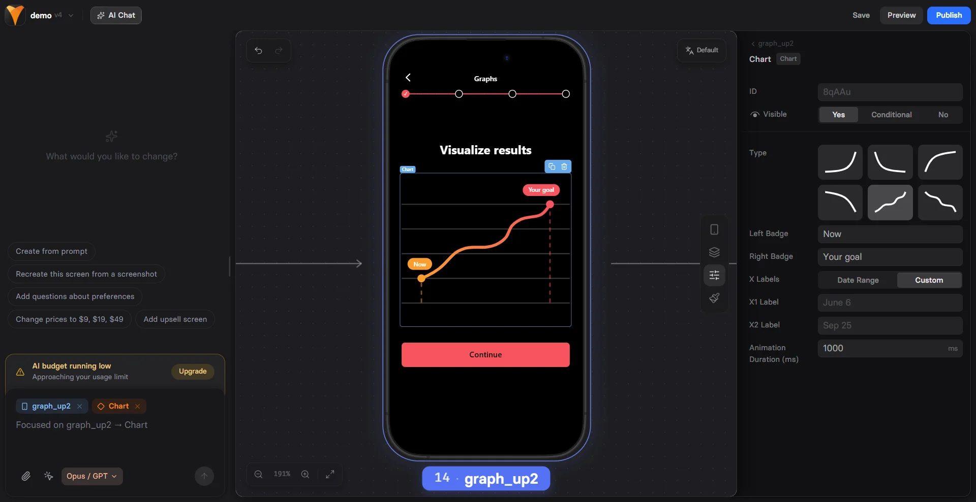
Line Type
Choose your visualization style:Data Points
Define your chart’s journey: Start Value- Current state or baseline
- Can use variables:
{{current-weight}} - Sets emotional starting point
- Goal or target state
- Shows achievable outcome
- Time period for transformation
- Today to future date
- Creates urgency and realistic timeline
Visual Elements
Badges Add context at specific points:1000ms- Quick reveal2000ms- Dramatic build3000ms- Slow emphasis
Creating Emotional Impact
The Progress Principle
Charts leverage psychological principles:- Visualization - Seeing the journey makes it feel achievable
- Commitment - Imagining success increases investment
- Gap Awareness - Shows distance between current and desired state
- Social Proof - Implies others have succeeded
Personalization Strategy
Most effective approach:1
Collect Current State
Use Text Input or Options:
“What’s your current weight?”
2
Gather Goal
“What’s your target weight?”
3
Show Personalized Chart
Chart from
{{current}} to {{target}}
“Your 90-day transformation”4
Present Offer
“Start your journey today”
Checkout or Plan Picker
Common Patterns
Weight Loss Funnel
Learning Progress
Savings Growth
Fitness Journey
Mobile Optimization
Charts adapt beautifully to mobile: Responsive Scaling- Maintains proportions
- Touch-friendly interaction
- Clear label visibility
- Lightweight SVG rendering
- Smooth animations
- No layout shift
- Automatic font sizing
- High contrast colors
- Clear data points
Combining with Other Elements
Chart + Testimonial
Chart + Timer
Chart + Options
Psychology Tips
Make It Achievable
- Show realistic progress
- Use gradual curves, not steep lines
- Include minor setbacks for authenticity
Create Anticipation
- Slow animation builds excitement
- Reveal chart after collecting goals
- Use ascending trends (up and to the right)
Build Credibility
- Add “Based on average results” text
- Include disclaimer if needed
- Show realistic timelines
Design Best Practices
Color Psychology
- Green - Growth, health, money
- Blue - Trust, stability, calm
- Orange - Energy, enthusiasm
- Purple - Transformation, premium
Visual Hierarchy
- Chart dominates the screen
- Clear start/end labels
- Supporting text below
- CTA button prominent
Animation Timing
- Trigger on scroll into view
- Not too fast (loses impact)
- Not too slow (loses attention)
- Sync with other animations
Testing Variables
A/B test these elements:- Chart type - Line vs Area
- Animation speed - 1s vs 3s
- Personalization - Generic vs Custom
- Timeline - 30 vs 60 vs 90 days
- Badge text - Different messaging
Troubleshooting
Chart not animating
Chart not animating
- Check animation duration is set
- Verify chart is visible on page
- Look for JavaScript errors
- Test in different browser
Variables not working in badges
Variables not working in badges
- Use exact variable syntax
{{variable}} - Ensure variables are set before chart loads
- Check for typos in variable names
- Verify data is collected earlier in funnel
Chart looks wrong on mobile
Chart looks wrong on mobile
- Avoid very long date ranges
- Keep badge text concise
- Test actual mobile devices
- Check responsive breakpoints
Data points incorrect
Data points incorrect
- Verify start/end values
- Check variable calculations
- Ensure numeric values (not strings)
- Test with static values first
Conversion Impact
Charts increase conversion by:- Visualization: +15-20% when personalized
- Commitment: +10-15% emotional investment
- Credibility: +5-10% with realistic progress
Charts work best in the middle of funnels, after collecting user data
but before presenting offers.
Advanced Techniques
Multi-Chart Comparison
Show different scenarios:Interactive Charts
Combine with inputs:Social Proof Integration
Next Steps
- Collect user data for personalization
- Add testimonials for credibility
- Create urgency with timers
- Present offers after visualization