> ## Documentation Index
> Fetch the complete documentation index at: https://funnelfox.com/docs/llms.txt
> Use this file to discover all available pages before exploring further.
# Text element
> Add and style text elements in your FunnelFox funnels. Configure fonts, colors, spacing, dynamic variables, and responsive text.
The Text element is your primary tool for adding written content to funnels.
From attention-grabbing headlines to detailed paragraphs, it handles all text
needs with rich formatting, animations, and dynamic variables.
 ## Common Use Cases
Attention-grabbing titles that communicate your value proposition
Detailed descriptions, benefits, and supporting information
Personalized text using variables like "Welcome back, \{\{name}}!"
Terms, disclaimers, and compliance text with consistent formatting
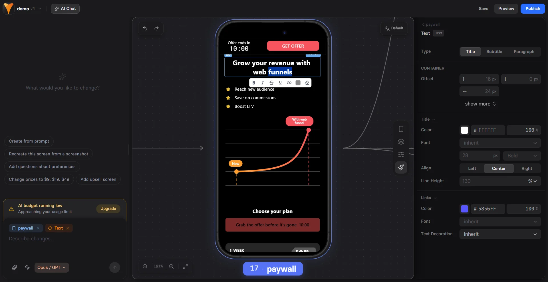
## Properties
### Parameters Tab
#### Type
Quick style presets that apply predefined formatting:
| Type | Use Case | Default Style |
| ------------- | --------------- | --------------------------- |
| **Title** | Main headlines | Large, bold, prominent |
| **Subtitle** | Section headers | Medium size, less weight |
| **Paragraph** | Body text | Regular size, normal weight |
Switch between types anytime to quickly restyle your text. Each type is just
a preset - you can customize any style property afterward.
#### Animation
Add engaging typing animations when text appears:
* **Off**: Text appears instantly (default)
* **Slow**: Leisurely typing effect (\~40 characters/second)
* **Medium**: Balanced speed (\~60 characters/second)
* **Fast**: Quick typing (\~80 characters/second)
* **Rapid**: Very fast typing (\~100 characters/second)
The animation triggers when the element first appears on screen, creating
a dynamic feel that draws attention to important messages.
For common properties (ID, Visibility), see [Elements Overview](/elements/overview#common-properties).
### Rich Text Editor
The inline editor toolbar provides formatting options for selected text:
Make text **bold** for emphasis
Add *italic* styling for subtle emphasis
Show ~~crossed out~~ text for comparisons
Underline important text
Turn text into clickable links
Change color of selected text
Remove custom formatting from selection
### Variables
Insert dynamic content using variables:
```
Welcome back, {{name}}!
Your selected plan: {{plan-name}}
Special {{discount}}% off today!
```
Variables are replaced with actual values from user inputs or system data.
See [Variables documentation](/editor/variables) for details.
## Styles Tab
### Typography Settings
Control the overall text appearance:
#### Type-Specific Styles
Each text type (Title, Subtitle, Paragraph) has independent style controls:
* **Color**: Text color with opacity
* **Font**: Choose from available fonts
* **Size**: Font size in pixels
* **Weight**: 100 (thin) to 900 (black)
* **Align**: Left, Center, or Right alignment
* **Line Height**: Percentage of font size (e.g., 130% for comfortable reading)
#### Links Styling
Separate styling for links within your text:
* **Color**: Link color (often blue or branded)
* **Font Weight**: Regular, Bold, etc.
* **Text Decoration**: Inherit, Underline, or None
### Apply Styles Globally
The **"apply styles to all titles"** button (or subtitles/paragraphs) sets
the default styling for that text type. This affects:
* **New elements**: All future text elements of that type
* **Non-customized elements**: Existing elements using default styles
* **NOT customized elements**: Elements with manual style changes keep their custom formatting
To apply global styles to a customized element, first click **"restore defaults"**
to reset it to theme styles, then the global styles will apply.
### Container Styles
For common container properties (padding, background, borders), see
[Elements Overview](/elements/overview#styles-tab).
## Examples
### Personalized Welcome
```
🎉 Welcome back, {{first-name}}!
We've been saving your {{product-category}} items.
Ready to complete your purchase?
```
### Benefit Statement with Emphasis
```
Save **50% off** your first month
~~$99~~ Just $49 today only!
✓ Instant access
✓ Cancel anytime
✓ 30-day guarantee
```
### Multi-Style Headline
Create visual hierarchy with mixed formatting:
* Main headline as **Title** type
* Subheading as **Subtitle** type
* Details as **Paragraph** type
All in separate text elements for maximum control.
## Best Practices
Break long text into short paragraphs. Users scan, they don't read
word-for-word.
Title → Subtitle → Paragraph creates natural reading flow and
visual structure.
Use typing animation for key messages only. Too much movement
becomes distracting.
Always preview how text looks when variables are empty or have
long values.
### Performance Tips
* **Limit animations**: Multiple typing animations can feel overwhelming
* **Optimize line length**: 50-75 characters per line for best readability
* **Use web-safe fonts**: Custom fonts may slow loading
* **Test on mobile**: Text that looks good on desktop might be too small on phones
### Accessibility
* Maintain **high contrast** between text and background
* Keep body text at **minimum 16px** on mobile
* Use **semantic types** (Title for headings, Paragraph for body)
* Avoid conveying meaning through color alone
## Troubleshooting
* Check Animation is not set to "Off"
* Verify element visibility is "Yes"
* Animation only plays once per page load
* Try refreshing preview to replay
* Ensure variable exists (check input element IDs)
* Use exact variable name with correct case
* Variables only show after user provides input
* Check \{\{variable-name}} syntax
* Select text first before clicking format buttons
* Some formatting may conflict (can't be bold and not bold)
* Use eraser tool to clear conflicting styles
* Check if global styles are overriding
* Ensure URL includes https\:// or http\://
* Test in preview mode, not editor
* Check link color contrast is visible
* Verify no overlapping invisible elements
* Reduce font size for mobile screens
* Check padding isn't pushing text off screen
* Test with longest possible variable values
* Consider shorter copy for mobile
## Next Steps
* [Button Element](/elements/button) - Add clickable CTAs
* [Variables](/editor/variables) - Make text dynamic
* [Elements Overview](/elements/overview) - Learn about other elements
## Common Use Cases
Attention-grabbing titles that communicate your value proposition
Detailed descriptions, benefits, and supporting information
Personalized text using variables like "Welcome back, \{\{name}}!"
Terms, disclaimers, and compliance text with consistent formatting
## Properties
### Parameters Tab
#### Type
Quick style presets that apply predefined formatting:
| Type | Use Case | Default Style |
| ------------- | --------------- | --------------------------- |
| **Title** | Main headlines | Large, bold, prominent |
| **Subtitle** | Section headers | Medium size, less weight |
| **Paragraph** | Body text | Regular size, normal weight |
Switch between types anytime to quickly restyle your text. Each type is just
a preset - you can customize any style property afterward.
#### Animation
Add engaging typing animations when text appears:
* **Off**: Text appears instantly (default)
* **Slow**: Leisurely typing effect (\~40 characters/second)
* **Medium**: Balanced speed (\~60 characters/second)
* **Fast**: Quick typing (\~80 characters/second)
* **Rapid**: Very fast typing (\~100 characters/second)
The animation triggers when the element first appears on screen, creating
a dynamic feel that draws attention to important messages.
For common properties (ID, Visibility), see [Elements Overview](/elements/overview#common-properties).
### Rich Text Editor
The inline editor toolbar provides formatting options for selected text:
Make text **bold** for emphasis
Add *italic* styling for subtle emphasis
Show ~~crossed out~~ text for comparisons
Underline important text
Turn text into clickable links
Change color of selected text
Remove custom formatting from selection
### Variables
Insert dynamic content using variables:
```
Welcome back, {{name}}!
Your selected plan: {{plan-name}}
Special {{discount}}% off today!
```
Variables are replaced with actual values from user inputs or system data.
See [Variables documentation](/editor/variables) for details.
## Styles Tab
### Typography Settings
Control the overall text appearance:
#### Type-Specific Styles
Each text type (Title, Subtitle, Paragraph) has independent style controls:
* **Color**: Text color with opacity
* **Font**: Choose from available fonts
* **Size**: Font size in pixels
* **Weight**: 100 (thin) to 900 (black)
* **Align**: Left, Center, or Right alignment
* **Line Height**: Percentage of font size (e.g., 130% for comfortable reading)
#### Links Styling
Separate styling for links within your text:
* **Color**: Link color (often blue or branded)
* **Font Weight**: Regular, Bold, etc.
* **Text Decoration**: Inherit, Underline, or None
### Apply Styles Globally
The **"apply styles to all titles"** button (or subtitles/paragraphs) sets
the default styling for that text type. This affects:
* **New elements**: All future text elements of that type
* **Non-customized elements**: Existing elements using default styles
* **NOT customized elements**: Elements with manual style changes keep their custom formatting
To apply global styles to a customized element, first click **"restore defaults"**
to reset it to theme styles, then the global styles will apply.
### Container Styles
For common container properties (padding, background, borders), see
[Elements Overview](/elements/overview#styles-tab).
## Examples
### Personalized Welcome
```
🎉 Welcome back, {{first-name}}!
We've been saving your {{product-category}} items.
Ready to complete your purchase?
```
### Benefit Statement with Emphasis
```
Save **50% off** your first month
~~$99~~ Just $49 today only!
✓ Instant access
✓ Cancel anytime
✓ 30-day guarantee
```
### Multi-Style Headline
Create visual hierarchy with mixed formatting:
* Main headline as **Title** type
* Subheading as **Subtitle** type
* Details as **Paragraph** type
All in separate text elements for maximum control.
## Best Practices
Break long text into short paragraphs. Users scan, they don't read
word-for-word.
Title → Subtitle → Paragraph creates natural reading flow and
visual structure.
Use typing animation for key messages only. Too much movement
becomes distracting.
Always preview how text looks when variables are empty or have
long values.
### Performance Tips
* **Limit animations**: Multiple typing animations can feel overwhelming
* **Optimize line length**: 50-75 characters per line for best readability
* **Use web-safe fonts**: Custom fonts may slow loading
* **Test on mobile**: Text that looks good on desktop might be too small on phones
### Accessibility
* Maintain **high contrast** between text and background
* Keep body text at **minimum 16px** on mobile
* Use **semantic types** (Title for headings, Paragraph for body)
* Avoid conveying meaning through color alone
## Troubleshooting
* Check Animation is not set to "Off"
* Verify element visibility is "Yes"
* Animation only plays once per page load
* Try refreshing preview to replay
* Ensure variable exists (check input element IDs)
* Use exact variable name with correct case
* Variables only show after user provides input
* Check \{\{variable-name}} syntax
* Select text first before clicking format buttons
* Some formatting may conflict (can't be bold and not bold)
* Use eraser tool to clear conflicting styles
* Check if global styles are overriding
* Ensure URL includes https\:// or http\://
* Test in preview mode, not editor
* Check link color contrast is visible
* Verify no overlapping invisible elements
* Reduce font size for mobile screens
* Check padding isn't pushing text off screen
* Test with longest possible variable values
* Consider shorter copy for mobile
## Next Steps
* [Button Element](/elements/button) - Add clickable CTAs
* [Variables](/editor/variables) - Make text dynamic
* [Elements Overview](/elements/overview) - Learn about other elements