> ## Documentation Index
> Fetch the complete documentation index at: https://funnelfox.com/docs/llms.txt
> Use this file to discover all available pages before exploring further.
# Custom element
> Write your own element in HTML, CSS, and JavaScript, save it to your project, and reuse it in any funnel with settings in Properties.
A custom element is an element you write yourself in HTML, CSS, and
JavaScript and save to your project. Use it when no built-in element matches
what you need, for example, when you recreate a screen from a reference or a
URL with AI Chat.
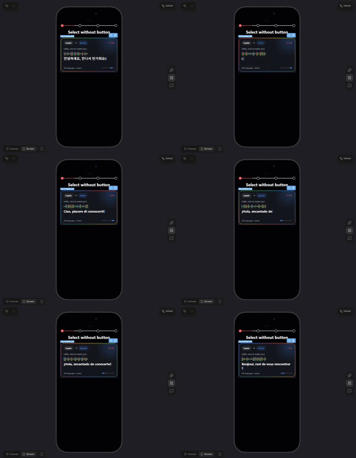
## How it works
A custom element lets you build anything built-in elements can't, such as
animated buttons, charts, badges, or anything else. You write it once as an
HTML fragment, then reuse it on any screen in any funnel of the project.
Each save creates a new version (v1, v2...). Funnels keep the version they
use until you open them in the editor, save, and publish.
Custom elements are available in every project. Anyone who can edit funnels
in the project can work with them.

## Create custom element
Create custom elements with AI Chat, or write the code yourself. You can also have Claude write the code from this page.
> [tab] With AI Chat
>
> **1. Open AI Chat**
>
> Open [AI Chat in Editor](https://funnelfox.com/docs/agentic-solution/overview.md#ai-chat-in-editor)
> in the selector on the right. In the model
> menu, check that **Engine** is set to **v2**.
>
> **2. Share reference**
>
> [Attach a reference image](https://funnelfox.com/docs/agentic-solution/overview.md#build-from-a-reference)
> or [paste a funnel link](https://funnelfox.com/docs/agentic-solution/overview.md#build-from-url).
> When no built-in element matches part of it, the agent writes, saves,
> and places a custom element for you.
>
> Or describe the element, for example
> `create a custom element that shows a score in a ring`.
> [tab] Manually or with Claude
>
> **1. Open code editor**
>
> Open the **Elements** tab on the left, click **Add element** and go
> to **Custom**. Click **New custom element**.
>
> **2. Write code**
>
> Replace the starter code with your element. See the
> [Custom elements reference](#custom-elements-reference).
>
> > [!TIP]
> >
> > Click **Copy page** at the top of this page or open it in Claude,
> > and ask Claude to write the element for you.
>
> **3. Save**
>
> Errors, warnings, and notes appear under the code with their line and
> column. Click **Create** to save the element as version 1. You can't
> save while the code has errors.
>
> > [!TIP]
> >
> > The element appears in the **Custom** group of the **Add element**
> > menu.
## Use custom elements
Prompt [AI Chat in Editor](https://funnelfox.com/docs/agentic-solution/overview.md#ai-chat-in-editor) to
add a custom element by its name. When you rebuild a screen from a reference
or a URL, AI Chat reuses your project's custom elements, or creates new ones
when no built-in element matches.
Or add them manually:
**1. Add element**
Open the **Elements** tab on the left, click **Add element** and go to
**Custom**. You can also type the element's name in the search. Click
the element to add it to the current screen.
**2. Configure element**
Open Properties in the selector on the right and go to the
**Parameters** tab. Below the common settings, such as ID and
[visibility](https://funnelfox.com/docs/elements/overview.md#visibility), you see the props declared
in the element's code.
The header of the props section shows:
* **Version**: The version this element uses, for example *v2*.
* **Update to vN**: Appears when the project has a newer version. Click
it to move this element to the latest version.
* **Edit custom element**: The gear icon opens the code editor.
**3. Style element**
Go to **Properties > Styles** to adjust the **Container** section and the
[style groups](#style-groups) the element declares.
## Edit custom element
Open the code editor in one of these ways:
* Right-click the element in the **Elements** tab and select **Edit custom
element**.
* Click **Edit** next to the element in **Add element > Custom**.

The code editor opens with the latest version. Its subtitle shows the
version you're about to create, for example *v2 → v3*. Change the code and
click **Save new version**.

If the new version removes a prop or changes its type, elements lose that
prop's value. The editor shows **Values at risk · this funnel** first. Click
**Save anyway** to save.
To keep the values, add a migration step to the code yourself or ask AI Chat
to add it. A step moves values from version N to the version you're saving:
```html Migration steps theme={null}
```
* `config` holds the element's props.
* `ctx.move()` renames a prop and moves its translations.
* Steps run only in the editor, when a funnel moves to the new version. They
can't use `ff`, the page, timers, or the network.
### Versioning
Saving a new version doesn't change any funnel. For example, a published
funnel uses v1 and you save v2:
1. **The live funnel stays on v1.**
2. **You open the funnel in the editor**: Its elements switch to v2
automatically, as an unsaved change. The live funnel is still on v1.
3. **You save and publish the funnel**: The live funnel switches to v2.
> [!WARNING]
>
> A funnel nobody opens in the editor stays on v1.
When the elements switch versions, settings you changed keep their values.
Settings you left at the default take the new default.
If an element doesn't switch automatically, click **Update to vN** in
**Properties > Parameters**.
## Manage custom elements
Custom elements can't be deleted. To hide one from your elements selector, open the code
editor and click **Hide from menu**. The element disappears from the **Add
element** menu, but funnels that already use it keep showing it. To offer it
again, click **Show in menu**.

Custom elements you paste from another project, or that come with a
template, are copied into your project. If you can't access the original
project, the element shows **Custom element not found** and the funnel can't
be published.
## Custom element localization
Text props of custom elements are translated together with the rest of the
funnel. Learn about [localizations](https://funnelfox.com/docs/editor/localizations.md).
* **`text` props**: Translated like texts of built-in elements.
* **`asset` props**: Can be changed per language, but aren't translated
automatically.
* **`text` props with the `id` or `emoji` format**: Never translated.
Text typed directly into the markup isn't translatable. The code itself is
never sent for translation.
## Custom elements reference
### Fragment structure
A custom element is one HTML fragment with up to four parts:
| Part | How to write it | Required | What it does |
| - | - | - | - |
| Manifest | `
```
### Manifest
**name** `string`
The element's name in the **Add element** menu and the **Elements** tab.
**props** `object`
The element's settings in **Properties > Parameters**. See [Props](#props).
**styles** `object`
Optional style settings in **Properties > Styles**. See
[Style groups](#style-groups).
Keep `schema`, `api`, `category`, `engine`, and `ssr` as they are in the
starter code.
### Props
Each prop is a key under `props` with a `type`, a `label` shown in
**Properties**, and a `default` value:
| Type | Value | Options |
| - | - | - |
| `text` | Text | `format`: `plain` (default), `multiline`, `id`, or `emoji` |
| `number` | Number | `min`, `max`, `step`, `units` (for example `["px"]` or `["s"]`) |
| `boolean` | Yes or no | — |
| `enum` | One value from a list | `values`: a list of strings, numbers, or `{ "value": ..., "label": ... }` objects |
| `color` | Color | `default` can be a hex color or a theme color, such as `var(--app-color-primary)` |
| `asset` | Image, video, or Lottie animation | `kind`: `image`, `video`, or `lottie` |
| `ref` | A screen of the funnel | `to`: `screen` |
| `action` | An [action](https://funnelfox.com/docs/editor/actions.md) | `actions`: the action types to offer, such as `["navigate", "link", "scroll", "visibility"]` |
| `list` | A list of items | `of`: the fields of each item, or `item`: a single field; `min`, `max` |
| `group` | Several props shown together | `fields`: the props in the group |
| `variant` | One of several sets of props | `discriminator` and `variants` |
For an `action` prop, write `"default": "navigate"` to navigate to the next
screen by default. Any other default action needs the full action object.
> [!TIP]
>
> Show all visible text through text props instead of typing it into the
> markup. Text typed into the markup can't be edited in **Properties** or
> translated.
### Bindings
Bindings connect props to the markup and CSS. FunnelFox applies them before
any script runs and again every time a prop changes. Every prop a binding
names must be declared in the manifest.
| Binding | What it does |
| - | - |
| `data-ff-prop="label"` | Sets the node's text to the `label` prop |
| `data-ff-attr="src:image alt:caption"` | Sets attributes from props, as `attribute:prop` pairs separated by spaces |
| `data-ff-show="showRing"` | Hides the node unless the `showRing` prop is true |
| `data-ff-action="action"` | Runs the `action` prop when the visitor clicks the node or presses Enter or Space |
| `var(--p-label)` | CSS variable for every `color`, `number`, `enum`, and `boolean` prop. Numbers get their unit, and booleans become `1` or `0` |
| `var(--app-...)` | Your funnel's [theme](https://funnelfox.com/docs/editor/themes.md) values, such as `var(--app-color-primary)` or `var(--app-border-radius-box)` |
### Scripts
Each `
```
This documentation is built and hosted on [Mintlify](https://mintlify.com), a developer documentation platform.