> ## Documentation Index
> Fetch the complete documentation index at: https://funnelfox.com/docs/llms.txt
> Use this file to discover all available pages before exploring further.
# Container element
> Flexible layout element for organizing and grouping content
The Container element is your layout powerhouse, allowing you to group elements
together and create sophisticated designs. Think of it as a box that holds
other elements, giving you control over spacing, alignment, and visual hierarchy.
 ## When to Use
Essential for:
* **Multi-column layouts** - Side-by-side content
* **Card designs** - Boxed content with backgrounds
* **Spacing control** - Consistent gaps between elements
* **Visual grouping** - Related content sections
* **Responsive layouts** - Mobile-optimized structures
## How Containers Work
Containers can hold any other elements, including other containers. This
nesting creates powerful layout possibilities:
```
Container (Row)
├── Container (Column) - Left side
│ ├── Image
│ └── Text
└── Container (Column) - Right side
├── Heading
└── Button
```
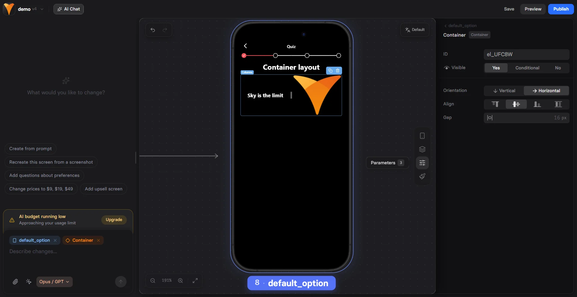
## Orientation
Choose how elements arrange inside:
### Rows (Horizontal)
Elements placed side-by-side:
* Desktop: True horizontal layout
* Mobile: Often stacks vertically
* Use for: Navigation bars, feature lists
### Columns (Vertical)
Elements stack top-to-bottom:
* Consistent across devices
* Natural reading flow
* Use for: Forms, content sections
Start with Columns for mobile-first design. Rows work best for specific
desktop layouts that gracefully degrade to columns on mobile.
## Spacing & Alignment
### Gap
Space between child elements:
* `0px` - Elements touch
* `10px` - Tight spacing
* `20px` - Standard spacing
* `40px` - Breathing room
The gap applies consistently between all children, maintaining visual rhythm.
### Alignment
Control how children position:
**Horizontal Alignment**
* **Left** - Start of container
* **Center** - Centered horizontally
* **Right** - End of container
**Vertical Alignment**
* **Top** - Align to top
* **Middle** - Center vertically
* **Bottom** - Align to bottom
```
Example: Centered card
Container:
- Horizontal: Center
- Vertical: Middle
- Contains: Icon, Title, Description, Button
```
## Visual Styling
### Backgrounds
Transform containers into cards:
**Solid Colors**
* Add background color
* Adjust opacity for overlays
* Create visual separation
**Images**
Background images for rich designs:
* Hero sections
* Patterned backgrounds
* Branded sections
### Borders & Shadows
**Borders**
Frame your content:
* Width: 1-5px typically
* Color: Match brand colors
* Style: Solid, dashed, dotted
**Shadows**
Add depth and elevation:
* Subtle: Slight elevation
* Medium: Clear separation
* Strong: Floating effect
**Border Radius**
Round those corners:
* `0px` - Sharp edges
* `8px` - Modern cards
* `16px` - Soft containers
* `50%` - Circular (if square)
## Common Patterns
### Two-Column Layout
```
Container (Row)
├── Container (Column) - 50% width
│ └── Content A
└── Container (Column) - 50% width
└── Content B
```
Mobile: Automatically stacks
### Feature Cards
```
Container (Column) - With background
├── Icon/Image
├── Heading
├── Description
└── CTA Button
```
### Testimonial Box
```
Container - With shadow & padding
├── Quote text
├── Container (Row)
│ ├── Avatar image
│ └── Container (Column)
│ ├── Name
│ └── Title
```
### Pricing Table
```
Container (Row) - Parent
├── Container (Plan 1) - With border
├── Container (Plan 2) - Featured with shadow
└── Container (Plan 3) - With border
```
## Mobile Optimization
Containers adapt intelligently:
### Responsive Behavior
* **Rows → Columns** - Horizontal layouts stack vertically
* **Proportional spacing** - Gaps scale appropriately
* **Touch-friendly** - Padding increases on mobile
### Best Practices
1. Test row layouts on mobile
2. Use columns for critical content
3. Adjust gaps for mobile (usually smaller)
4. Consider hide/show for desktop-only layouts
Avoid deeply nested containers (more than 3 levels) as they complicate
mobile layouts and slow rendering.
## Advanced Techniques
### Sticky Containers
Make containers stick while scrolling:
**Position: Attached**
* Stays fixed in viewport
* Good for: CTAs, navigation
**Position: Attached on scroll**
* Becomes sticky after scrolling into view
* Good for: Share buttons, progress bars
### Overlay Effects
Create overlays with containers:
1. Background image on container
2. Semi-transparent color overlay
3. Text content on top
4. High contrast for readability
### Conditional Containers
Show/hide entire sections:
```
Container visibility: Conditional
If: {{user-type}} equals "premium"
Show: Premium content section
```
This hides all child elements too.
### Animation Ready
Containers work with entrance animations:
* Fade in groups of elements
* Slide in from side
* Scale up on appearance
## Performance Tips
### Optimize for Speed
* Limit nesting depth
* Use native CSS properties
* Compress background images
* Avoid too many shadows
### Reduce Complexity
* Combine similar containers
* Use gaps instead of margin/padding on children
* Leverage browser defaults
## Troubleshooting
* Check container alignment settings
* Verify orientation (row vs column)
* Look for conflicting child element positions
* Test without custom CSS first
* Ensure container has height (add padding)
* Check if children are positioned absolutely
* Verify background color opacity isn't 0
* Look for z-index issues
* Test with columns instead of rows
* Check for fixed widths on children
* Verify responsive breakpoints
* Reduce container nesting
* Gap only affects direct children
* Check if browser supports gap property
* Try padding as alternative
* Verify orientation matches expectation
## Design Examples
### Hero Section
```
Container (Column) - Full width, image background
├── Headline (H1)
├── Subheadline
├── Container (Row) - For buttons
│ ├── Primary CTA
│ └── Secondary CTA
└── Trust badges
```
### Feature Grid
```
Container (Row) - Parent
├── Container (Feature 1)
│ ├── Icon
│ ├── Title
│ └── Description
├── Container (Feature 2)
│ └── [Same structure]
└── Container (Feature 3)
└── [Same structure]
```
### Form Section
```
Container - With border & shadow
├── Form title
├── Text input (Email)
├── Text input (Name)
├── Container (Row) - For inline fields
│ ├── Input (First name)
│ └── Input (Last name)
└── Submit button
```
## Accessibility
Containers improve accessibility:
* **Semantic grouping** - Related content together
* **Visual hierarchy** - Clear content relationships
* **Focus management** - Tab order follows structure
* **Screen reader friendly** - Logical content flow
## Next Steps
* [Add elements](/elements/overview) inside containers
* [Style with backgrounds](/elements/overview#styles-tab)
* [Create responsive layouts](/editor/overview)
* [Use conditional visibility](/elements/overview#conditional-visibility)
## When to Use
Essential for:
* **Multi-column layouts** - Side-by-side content
* **Card designs** - Boxed content with backgrounds
* **Spacing control** - Consistent gaps between elements
* **Visual grouping** - Related content sections
* **Responsive layouts** - Mobile-optimized structures
## How Containers Work
Containers can hold any other elements, including other containers. This
nesting creates powerful layout possibilities:
```
Container (Row)
├── Container (Column) - Left side
│ ├── Image
│ └── Text
└── Container (Column) - Right side
├── Heading
└── Button
```
## Orientation
Choose how elements arrange inside:
### Rows (Horizontal)
Elements placed side-by-side:
* Desktop: True horizontal layout
* Mobile: Often stacks vertically
* Use for: Navigation bars, feature lists
### Columns (Vertical)
Elements stack top-to-bottom:
* Consistent across devices
* Natural reading flow
* Use for: Forms, content sections
Start with Columns for mobile-first design. Rows work best for specific
desktop layouts that gracefully degrade to columns on mobile.
## Spacing & Alignment
### Gap
Space between child elements:
* `0px` - Elements touch
* `10px` - Tight spacing
* `20px` - Standard spacing
* `40px` - Breathing room
The gap applies consistently between all children, maintaining visual rhythm.
### Alignment
Control how children position:
**Horizontal Alignment**
* **Left** - Start of container
* **Center** - Centered horizontally
* **Right** - End of container
**Vertical Alignment**
* **Top** - Align to top
* **Middle** - Center vertically
* **Bottom** - Align to bottom
```
Example: Centered card
Container:
- Horizontal: Center
- Vertical: Middle
- Contains: Icon, Title, Description, Button
```
## Visual Styling
### Backgrounds
Transform containers into cards:
**Solid Colors**
* Add background color
* Adjust opacity for overlays
* Create visual separation
**Images**
Background images for rich designs:
* Hero sections
* Patterned backgrounds
* Branded sections
### Borders & Shadows
**Borders**
Frame your content:
* Width: 1-5px typically
* Color: Match brand colors
* Style: Solid, dashed, dotted
**Shadows**
Add depth and elevation:
* Subtle: Slight elevation
* Medium: Clear separation
* Strong: Floating effect
**Border Radius**
Round those corners:
* `0px` - Sharp edges
* `8px` - Modern cards
* `16px` - Soft containers
* `50%` - Circular (if square)
## Common Patterns
### Two-Column Layout
```
Container (Row)
├── Container (Column) - 50% width
│ └── Content A
└── Container (Column) - 50% width
└── Content B
```
Mobile: Automatically stacks
### Feature Cards
```
Container (Column) - With background
├── Icon/Image
├── Heading
├── Description
└── CTA Button
```
### Testimonial Box
```
Container - With shadow & padding
├── Quote text
├── Container (Row)
│ ├── Avatar image
│ └── Container (Column)
│ ├── Name
│ └── Title
```
### Pricing Table
```
Container (Row) - Parent
├── Container (Plan 1) - With border
├── Container (Plan 2) - Featured with shadow
└── Container (Plan 3) - With border
```
## Mobile Optimization
Containers adapt intelligently:
### Responsive Behavior
* **Rows → Columns** - Horizontal layouts stack vertically
* **Proportional spacing** - Gaps scale appropriately
* **Touch-friendly** - Padding increases on mobile
### Best Practices
1. Test row layouts on mobile
2. Use columns for critical content
3. Adjust gaps for mobile (usually smaller)
4. Consider hide/show for desktop-only layouts
Avoid deeply nested containers (more than 3 levels) as they complicate
mobile layouts and slow rendering.
## Advanced Techniques
### Sticky Containers
Make containers stick while scrolling:
**Position: Attached**
* Stays fixed in viewport
* Good for: CTAs, navigation
**Position: Attached on scroll**
* Becomes sticky after scrolling into view
* Good for: Share buttons, progress bars
### Overlay Effects
Create overlays with containers:
1. Background image on container
2. Semi-transparent color overlay
3. Text content on top
4. High contrast for readability
### Conditional Containers
Show/hide entire sections:
```
Container visibility: Conditional
If: {{user-type}} equals "premium"
Show: Premium content section
```
This hides all child elements too.
### Animation Ready
Containers work with entrance animations:
* Fade in groups of elements
* Slide in from side
* Scale up on appearance
## Performance Tips
### Optimize for Speed
* Limit nesting depth
* Use native CSS properties
* Compress background images
* Avoid too many shadows
### Reduce Complexity
* Combine similar containers
* Use gaps instead of margin/padding on children
* Leverage browser defaults
## Troubleshooting
* Check container alignment settings
* Verify orientation (row vs column)
* Look for conflicting child element positions
* Test without custom CSS first
* Ensure container has height (add padding)
* Check if children are positioned absolutely
* Verify background color opacity isn't 0
* Look for z-index issues
* Test with columns instead of rows
* Check for fixed widths on children
* Verify responsive breakpoints
* Reduce container nesting
* Gap only affects direct children
* Check if browser supports gap property
* Try padding as alternative
* Verify orientation matches expectation
## Design Examples
### Hero Section
```
Container (Column) - Full width, image background
├── Headline (H1)
├── Subheadline
├── Container (Row) - For buttons
│ ├── Primary CTA
│ └── Secondary CTA
└── Trust badges
```
### Feature Grid
```
Container (Row) - Parent
├── Container (Feature 1)
│ ├── Icon
│ ├── Title
│ └── Description
├── Container (Feature 2)
│ └── [Same structure]
└── Container (Feature 3)
└── [Same structure]
```
### Form Section
```
Container - With border & shadow
├── Form title
├── Text input (Email)
├── Text input (Name)
├── Container (Row) - For inline fields
│ ├── Input (First name)
│ └── Input (Last name)
└── Submit button
```
## Accessibility
Containers improve accessibility:
* **Semantic grouping** - Related content together
* **Visual hierarchy** - Clear content relationships
* **Focus management** - Tab order follows structure
* **Screen reader friendly** - Logical content flow
## Next Steps
* [Add elements](/elements/overview) inside containers
* [Style with backgrounds](/elements/overview#styles-tab)
* [Create responsive layouts](/editor/overview)
* [Use conditional visibility](/elements/overview#conditional-visibility)